Constant Output: #Week 8
- Dan H. Lee
- Oct 27, 2019
- 1 min read

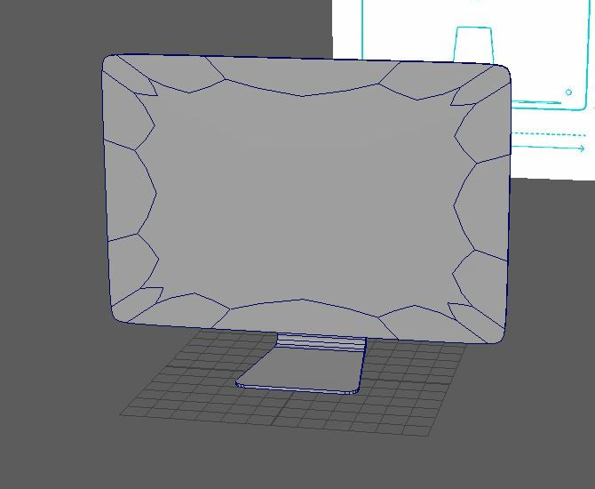
This week I attempted to create an iMac.

These are the angles where it looks not bad.

????
The front looks somewhat questionable. I couldn't think how to proceed on my own, so I referenced YouTube video.
The only one I could find was god-damn eyeballing everything. When I learned Photoshop, I was taught that not using a ruler is a sin. Today I have committed a sin.
(Apparently in Maya, you can't snap-to-grid when scaling which upsets me)

On the plus side, it looks nice with my keyboard. Would be really nice to be able to add texture so the screen doesn't look as bad as it is.


Comments